Is it always about simplification? Always?
I don’t think so. When we re-launch a logo, we do so for a lot of reasons. The current brand identity no longer fits who we’re turning into, perhaps because of new business opportunities or segments we’re getting into, or because it just looks dated and needs an upgrade. Or because we’re bored, new in our job and need to pay off favors. Ahem. Or something.
There are lots of good reasons to look at refreshing, upgrading and re-logo-ing your identity. It should always be done with care. It should always be done for a reason. It should always have enough statistical projection behind it to validate the expense and the trouble you will go through. We discussed that at length during the Gap fiasco.
Look at the new Starbucks logo.
It has lost the “Starbucks” name as well as “coffee.” It’s the green circle and the mermaid now. But look at a few significant others from the past year, from MySpace to Comedy Central to MTV to Seattle’s Best, and we see something common happening across all of them and others, too.
It seems that “new logo” has become synonymous with “simple.” And I don’t think that’s necessarily good.
A brief glance at 2010 (and early 2011) suggests that logos slowly simplify over time into globs of their former selves for the most part.
I’m guessing that we’ll arrive at the logo singularity sometime in 2050, when all logos will essentially all congeal into a colorless cross between the Nike swoosh and the Pop-n Fresh Dough Boy.
Can I present a slightly different case for identity?
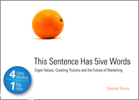
Remember the discussion we (some of us discussed it, at least) had on creating self-defining brand elements? In This Sentence Has 5ive Words: Eigen Values, Creating Truisms and the Future of Marketing, we talked about how branding and other outputs not always associated with “marketing stuff” should be self-defining.
The sentence, “This sentence has five words,” is self-defining. You don’t have to explain it. Saying it defines it. When we say, “This sentence has lots of words and plenty of syllables,” our statement is anything but unarguable. It’s subjective, fluffy and ultimately meaningless.
A logo is the very public face of your brand. That’s what its role is. By definition, your logo must be self-defining to your brand. So is your self-defining trajectory, the progression of your relationship with your market, getting simpler?
Should it be getting simpler? Or should it be getting more nuanced, more complex? Should it have more “interestingness” to it?
This isn’t a casual “yes/no” sort of question. Frankly, it depends entirely on the environment in which the brand is experienced as well as the sort of experience one has when interacting with it. Some brands are iconic, grab it off the clip strip and throw it in the shopping cart simple. Others, like the “Third Place,” are not.
They are meant to be pauses between home and work, or a different place altogether, where time can slow down and you can immerse yourself in whatever you need immersing in, be it work, conversation, reading, or coffee.
Is this an “iconic” brand that warrants a logo that you can completely grasp in a fast glance? Or is it an opportunity for visual interest, nuance and complexity?
I go back to the wonderful Designing Brand Identity (3rd edition) by Alina Wheeler to show you the logo designed for The Wild Center, the Natural History Museum of the Adirondacks, to bring this idea to life.
There are brands that are meant to be studied, just as there are certain logos that benefit from time spent looking at them. Patterns emerge that you didn’t see at first and the complexity is part of the beauty of the idea. You’ll see Alina’s write up on the project on page 288 and 289 of her book, which I’d suggest you pick up if you don’t have it already.
So why would a brand dedicated to stopping and being in the moment decide to simplify?
I’m not a designer. I’m not sitting on a pile of research. I just have a point of view, as do you in all probability. Do you think Starbucks could have created a nuanced, self-defining mark that would have invited more introspection, more time spent figuring it all out, one with some opportunity for discovery? Or am I missing something else more powerful?
Is “simple” always better? I don’t think so.
Tell me I’m wrong.
Regards.
[…] This post was mentioned on Twitter by StephenDenny, StephenDenny. StephenDenny said: The Coming Logo Singularity: Starbucks and the Simplified Logo, Simplified http://bit.ly/dSBB68 […]
Hey Stephen,
I tend to agree with your premise here. In the right hands, and for the right reasons, less is more. But, sometimes, more is more. Not every logo has to be parsed down to its most minimal form like the Nike swoosh or Apple apple.
In fairness, we don’t know the whole brand plan here, and we didn’t see the creative brief. We need to see how this logo lives within the entire brand. Formally, however, we can fairly critique. For me, it now looks “green and leafy”, which says “tea” more than “coffee”. I also agree that it conveys a sense of hurried-ness. Starbucks may indeed have a quick, in-and-out appeal for many, but it also has a stay and linger appeal that’s equally, if not more, important, and this logo doesn’t seem to reflect that.
This logo lacks a nuanced depth. It feels a bit cold and pre-fab, like an IKEA bookshelf. If feels disposable.
Can they get away without having their name integrated? Of course they can. You’d have to have lived in a hole for the past decade not to be able to instantly recognize that symbol, no matter where it’s placed. Still, I’m surprised they dropped the “Starbucks” and not just the “coffee”.
The mermaid has always symbolized great ingredients being brought to port from around the world. Sure, the new mark remains nautical, and true to that brand tenet. However, the typography and the circles gave the previous logo the feel of a stamp, or a seal of quality that you might see on the cargo being shipped. That’s lost now, and so too is the mystique it provided to the overall brand.
Will the average consumer feel that? Maybe not. Most people I know never even understood the mermaid or what it all symbolized to begin with, so losing it now isn’t going to cause disassociation. I for one thought that was, and is, a critical element of the brand. Perhaps they intend to play it down altogether now.
In the end, it’s hard to even call this a “new” logo. It’s really the previous logo, just decaffeinated. 🙂
Cheers,
Ken
Great post and thoughts.
Like many consumers (and as Ken pointed out), I never understood the symbol of the mermaid. I thought it was rather odd and unique, but there wasn’t some sort of “bigger” idea I associated with it. There wasn’t some sort of “deeper meaning” I associated with it. I just thought to myself, “there’s this place called Starbucks that people are going to for coffee…lemme check it out. Oh, and it has a weird logo.” Simple as that.
In the beginning, it’s important to make sure to have your name associated with whatever brand image you’re going to put out there in the market. At this point, however, Starbucks has become so huge that it’s able to make confident (and in some ways, “bold”) decisions like the one we see here. They’re basically saying: we think everyone knows what our mermaid stands for at this point. The mermaid is all that needs to be said.
Are they going to embrace this in all their markets? I’m not so sure that’s going to be the case. I think in the U.S. the logo “simplification” will happen, but I don’t know about the international markets. They make keep at least *some* of their original text, but who knows.
Ultimately though, they’re aiming for what a lot of the big/worldwide known brands have done like Apple, Pepsi, Windows, Nike, and Mercedes Benz. They are telling consumers that text is no longer important, their brand image should communicate to them exactly who they are and what they stand for.
Some have tweeted this isn’t the right move for them—that they could’ve done more, or that they’re simply not big enough worldwide to make a move like this. Those are fair arguments. Also Ken’s statement that the new logo feels a bit cold, like an IKEA bookshelf is a fair argument as well.
However, consumers more and more are wanting “clean” brand imaging. It makes sense, considering the world feels more complicated and when consumers look to brands, they often want to feel comfort or trust (especially nowadays). They want the imaging to be simple, direct, and without “much fuss” , and I feel Starbucks is embracing that movement. Could they have gone for something more ‘fancy’ or ‘revolutionary’? Sure…but I’m not sure that would resonate with their audience.
But, heck, I could be wrong, and only time will tell if this was a good move by Starbucks or not.
Ken: many thanks for a very thoughtful comment – I like the points you raise above, particularly the sense of mystery from the mermaid and the fact that the new logo feels hurried in the sense that the experience is meant to be faster. That’s what I took away from it and why I wonder if the “simpler is better” is really the point for most brands. We’ve been taught this as a matter of doctrine and frankly it’s a great and elegant choice where it makes sense – where a fast, iconic snapshot of the logo or product in use needs to convey the brand. In SBUX’s case, I’d argue it’s the opposite.
There are times for simplicity and there are times for more “interestingness.” We tend to lose the latter, which is too bad. Thanks again!
Cristian: thanks for your excellent points – interesting point regarding the greater brand interruptions correllating with a desire for simpler branding (I’m reading into what you said, so hope I’m catching your point). I certainly agree with the first part of your argument and wonder if what is needed is more simplification or more interest. One is “easier to mentally digest on the run” while the other aims for a different mark. A logo that creates an insider’s exclusivity through unexpected discovery (negative space, detail, Escher-like hidden meanings) or creates an opportunity for the viewer to experience more nuance than just a flat, 2 dimentional cling-cal styled logo. Few examples to point to.
SBUX could have done much worse – I’m not complaining here. I just think there’s an opportunity for brands who are more introspective, whose experience is more lasting rather than “efficient”, to slow down and interject a sense of interest and texture. When this is what the brand is and does, such a logo treatment becomes a self-defining Eigen Value.
Stephen, Your analysis is insightful as always. However, my opinion is that the Starbucks logo change is more practical than introspective. The real purpose of the re-design was to remove the words “Starbucks Coffee” from the logo, thereby allowing them to sell non-coffee products such as tea, beer, wine, ice cream, etc.
My gut is that Starbucks is about to embark and a line extension journey of epic proportions. The logo is the start of that journey.
I think the refresh of the Starbucks logo is just that, a refresh—not overly exciting but a natural progression for the brand. To do something totally different wouldn’t have made sense.
It seems the current discussion revolves around three main things:
• Lack of the Starbucks name
• Omitting the word “coffee”
• Design/simplicity of the logo and “Siren” icon itself
First, it’s my understanding that the name “Starbucks” is not exactly going away, although the push is to create more recognition for the “Siren” icon. The name will likely be locked-up to the “Siren” icon as needed.
It’s my feeling that the icon is strong enough to work by itself in many cases, as it is easily identifiable and visually associated with a very strong brand. Stronger emphasis on the symbol will also lead to more recognition and omitting “coffee” allows the necessary flexibility as they move beyond coffee and expand globally.
Regarding simplicity, I think this is a smart move to give the logo more visual impact in an increasingly noisy world. I also think the “Siren” graphic is interesting enough to hold one’s interest by itself. Even if the mermaid reference is not completely understood, I think the image is compelling for just this reason, as it makes one wonder about a deeper story.
But for a brand to be known only for a symbol, without words, isn’t that the holy grail that all brands dream about? Just like the most powerful symbols that we all recognize instantly, this seems to be the very essence of communication at its most primitive roots. Few brands are able to pull it off. I think Starbucks can.
Personally, I would still like to see some black integrated into the new logo—perhaps in the middle circular element. I think it would add more punch, but that’s just me.
Jay – thanks for your note, as always! – I’m completely on board with allowing the flexibility to avoid “coffee” if they’re getting into tea and other things that are separate and distinct from their coffee roots. If, being the operative word. If they want to be a general food company. That’s a big if, but now we’re having a strategic discussion and not a logo discussion. I read the press release and see that’s the general idea of where they’re going. Thanks!
Paul: thanks for your very thoughtful comment! I understand that SBUX is looking to diversify and thus feels it needs to lose the tether to coffee – I won’t give my random opinion on this today, as it would balloon this post to an unmanageable size. And in many cases, I agree that being an icon is what brands aspire to – look at Sony’s “S Mark” or Nike or Disney, etc.
However, it isn’t always about maximum efficiency. Sometimes it’s about creating a deeper relationship. I see a trends that suggests to me that simplification – a general dumbing down – of logo work is a means in and of itself. It looks like marketers and their agencies have confused “simplification” with progress. I’m wondering if that’s really the case, whether there’s a backswing to come and whether others also see a case for “interestingness.” We’ll see! Thanks!
Thanks for your response, Stephen. I’m all for a logo (or any well-designed communication, for that matter) that requires more introspection — it can certainly be a more engaging experience and leave a more lasting impression.
But may I also propose that your comments about simplicity are themselves an over-simplification? Not all simple logos are good, for sure, but simple logos are not necessarily lazy or dumbed-down either. In fact, any designer worth his/her salt will vouch for the fact that distilling down a logo to its essence: one that is on strategy, communicates everything that needs to be said, is effective, and still somehow unique and compelling, is among the most difficult assignments any designer can hope for.
Having said that, I agree that some recent rebranding initiatives have resulted in bad logos. They also happen to be simple, but I don’t believe that simple is bad in and of itself.
Paul: valid point – certainly, not all iconic logos are dumbed down. I wouldn’t want to try to defend that. Having just watched a whole pack of new logos come out last year, I was struck by how many were reductions, thus the thought. It seemed like there was a bit of a herd mentality driving these decisions and I’m always skeptical (in this post-Gap world) as to whether the brand has done its homework!
Many thanks for sharing your thoughts here –
Hi Stephen,
Excellent post and very interesting comments by contributors about the design and the brands ultimate objective. I am a massive fan of distilling your essence and clear communication. I like the simplicity of the logo but does everybody recognise the mermaid as Starbucks signature globally. I do not think so. I think this is at the heart of new logo to drive brand perception away from it association with Starbucks the name and coffee as a product.
Clearly they have faced stiff competition from new entrants to the market in the UK in particular. In Europe coffee is more prevalent but it’s a different type of consumer and cultural influences will have a significant impact on long term revenue in the global market. In America coffee is the staple product for millions of Americans. Clearly the mermaid is more recognisable in the American market.
In Europe and the UK it is a different story. In the UK tea is the most popular hot beverage and synomous with being British. In that respect the challenge is a different one. They have built a global brand and the environment of the message is just as important as the message itself. The issue of positioning is critical and emphasizing brand values starts with the consumer.
SBUX have stated they are trying to achieve brand stretch and want to take advantage of market opportunities with new products in different sectors. The resources at SBUX disposal make this a better alternative to doing nothing and watching market share eroded by competitors over time as consumer preferences and tastes change.
They are using their capabilities to exploit their reputation and values and apply them to new markets. Many companies have achieved this successfully. What we are seeing is the development of a new corporate strategic direction focused on diversification. The key for SBUX will be their ability to implement the new strategy so to some extent I think the issue of the design of the logo is peripheral.
The key to achieving their objectives will be their ability to exploit core competencies and leverage them by developing new products and services. I think this opens up a new set of questions. One thing is for sure it will be interesting to watch how SBUX implement this strategy as that will be the key to achieving their objective of brand extension.
Thanks for the response Stephen.
And yes, you read into what I said accurately. Great to see the additional commentaries on this piece. Terrific additional thoughts being shared.
Cheers!
Stephen,
Another perspective, from a Rice University marketing professor, suggests that the logo redesign was driven by preferences in Asia:
http://www.futurity.org/top-stories/starbucks-logo-sayonara-coffee-hello-asia/